
Moment
A brand built on one idea: no moment is ever lived the same way twice.
Brand Identity · Art Direction · Motion · UI · Social · Pitch Decks
- Role
- Founding Designer / Creative Director
- Team
- Solo designer working with the founders; 2 temporary designers on the first interface version; after the first client, a separate design team took over the product
- Company
- Moment, a New York startup
- Year
- Sep 2025 – Sep 2026
- Tools
- Figma, Rive, Midjourney, Weavy, Photoshop, Claude
- Outcome
- The complete brand, from concept to the first interface versions, plus social and decks. Moment went live and won four major clients: Miami Heat, Kaseya Center, Atlanta Hawks and State Farm Arena
Moment is a platform that connects brands to their audience’s calendars. Fans find and save moments in Moment Live; brands manage them behind the scenes in Moment Cloud. While I was there, Moment went live and won the Miami Heat, the Atlanta Hawks, Kaseya Center and State Farm Arena.
For a year, I was Moment’s founding designer, working side by side with the founders to create everything: the whole brand, from the concept to the first interface versions, along with all the social communication, decks and presentations.
I designed the first version of the interface with two temporary designers. Once we won the first client, another design team took over the product, and I focused on the brand, marketing and helping win new clients.
The Challenge
Moment started with no clients, no product in the market and no photography of its own. The brand had to win over teams and venues before there was anything live to show them.
And once it did, it would never stand alone on screen. A team or a sponsor is always there with its own colors and identity. The brand had to be memorable enough to own an idea, and quiet enough to let every client’s moment take the spotlight.
The Concept
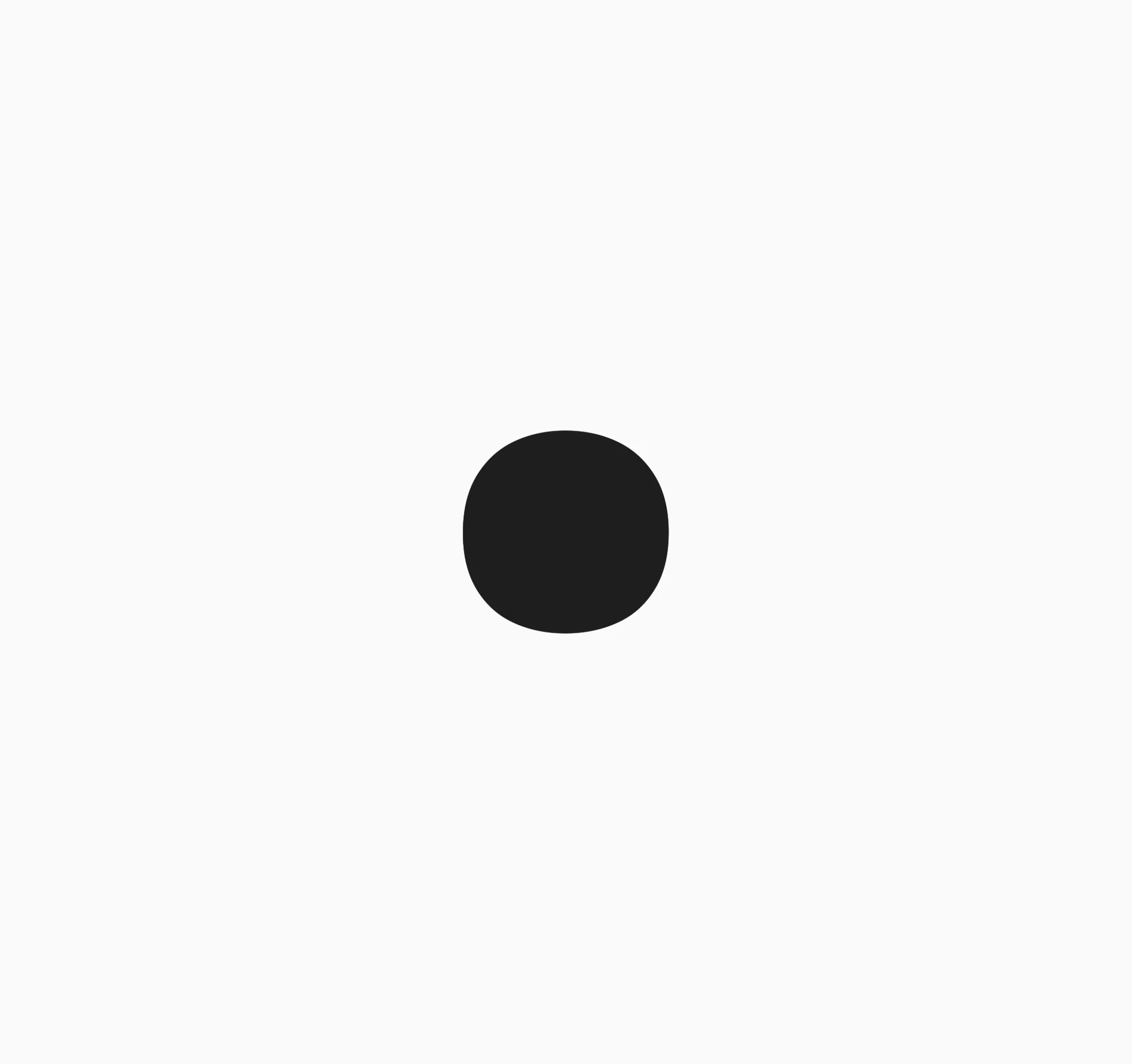
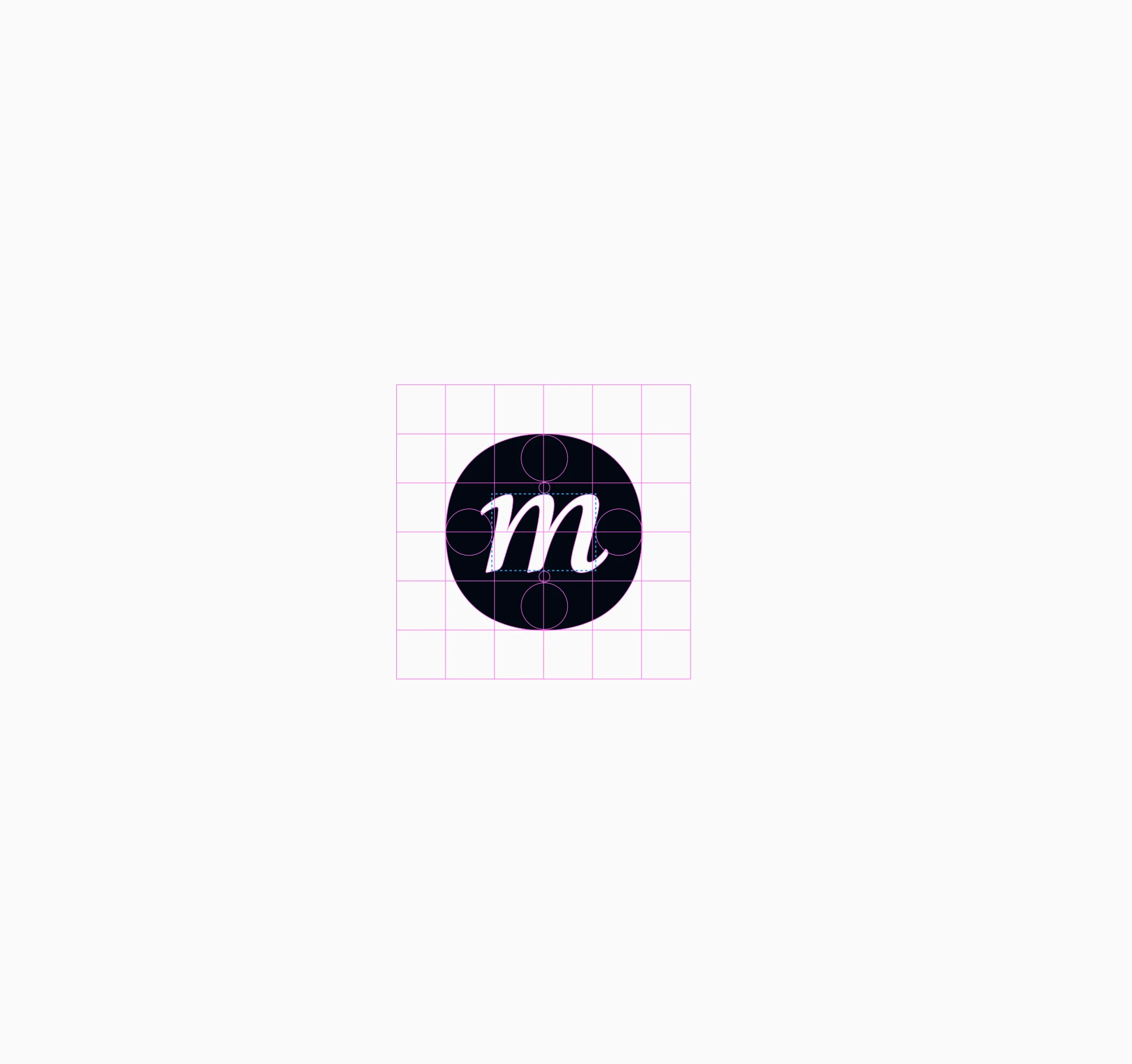
The symbol is an “m” sitting on a dot. The dot is not a perfect circle, on purpose: it stands for a moment, and a moment is never the same experience for everyone. Two people can live the same moment and remember it in completely different ways. So the circle is imperfect.
The Logotype
The logotype applies the same dot to the word itself. Set in an italic typeface for a touch of charm, “moment” gets cut by the dot: it removes part of the “o” and turns it into “ɔ”.
The cut is the idea: every moment leaves a mark on us, the kind of memory that stays.
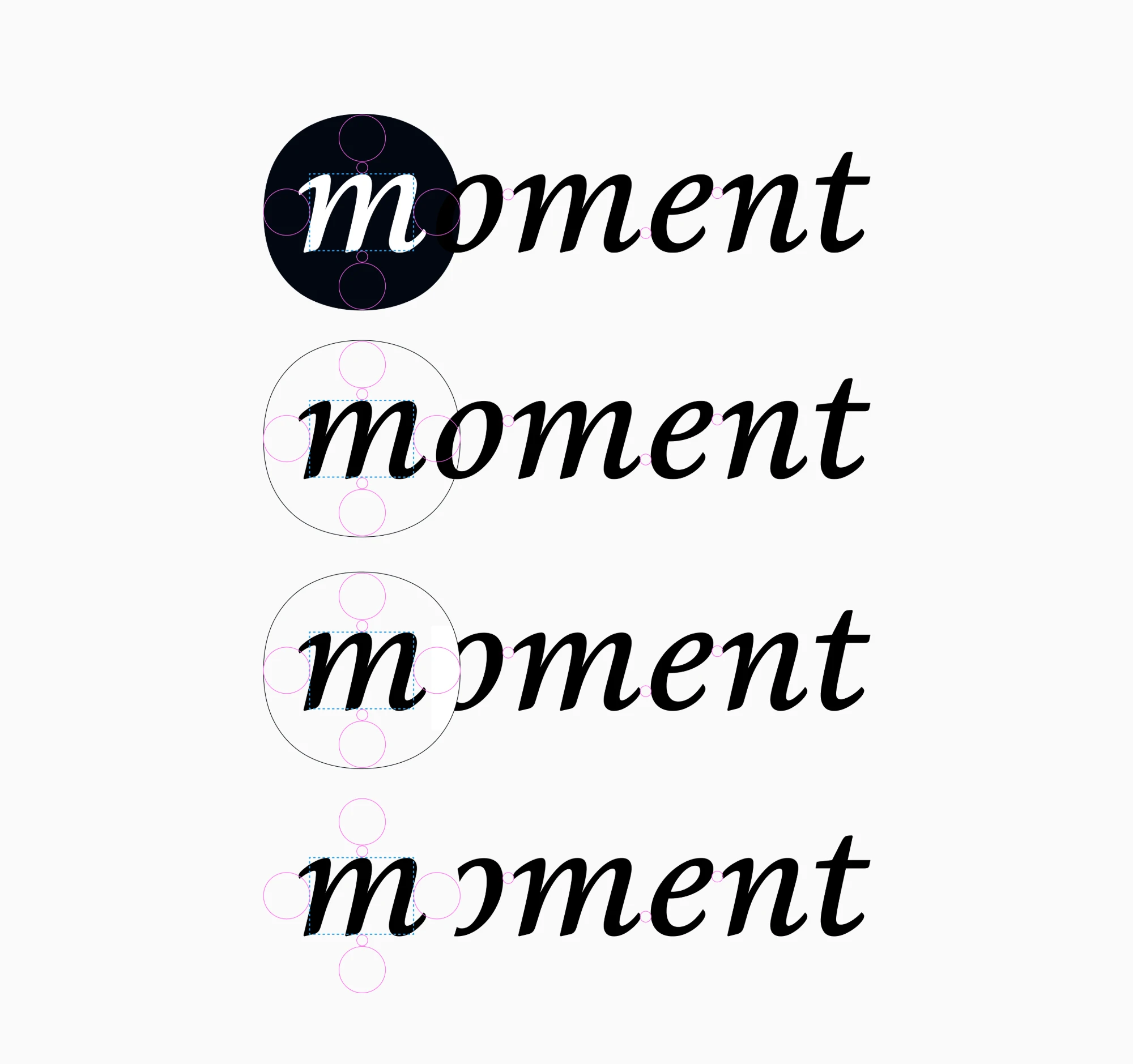 From dot to logotype: the dot cuts the “o”
The Ellipsis
With two products in the family, I extended the symbol into three dots. In the product, they work as the loading animation. In the brand, they read as an ellipsis: something that hasn’t happened yet. A brand uses Moment Cloud to create the potential of everything that can happen.
Color
The interfaces use black and white as their base. Moment is the stage; the brand and the moment are the show. A neutral interface lets them shine.
To test it, I ran an exercise: the same black-and-white frame over any color a client or an emotion could bring. The brand holds; the color belongs to the moment.
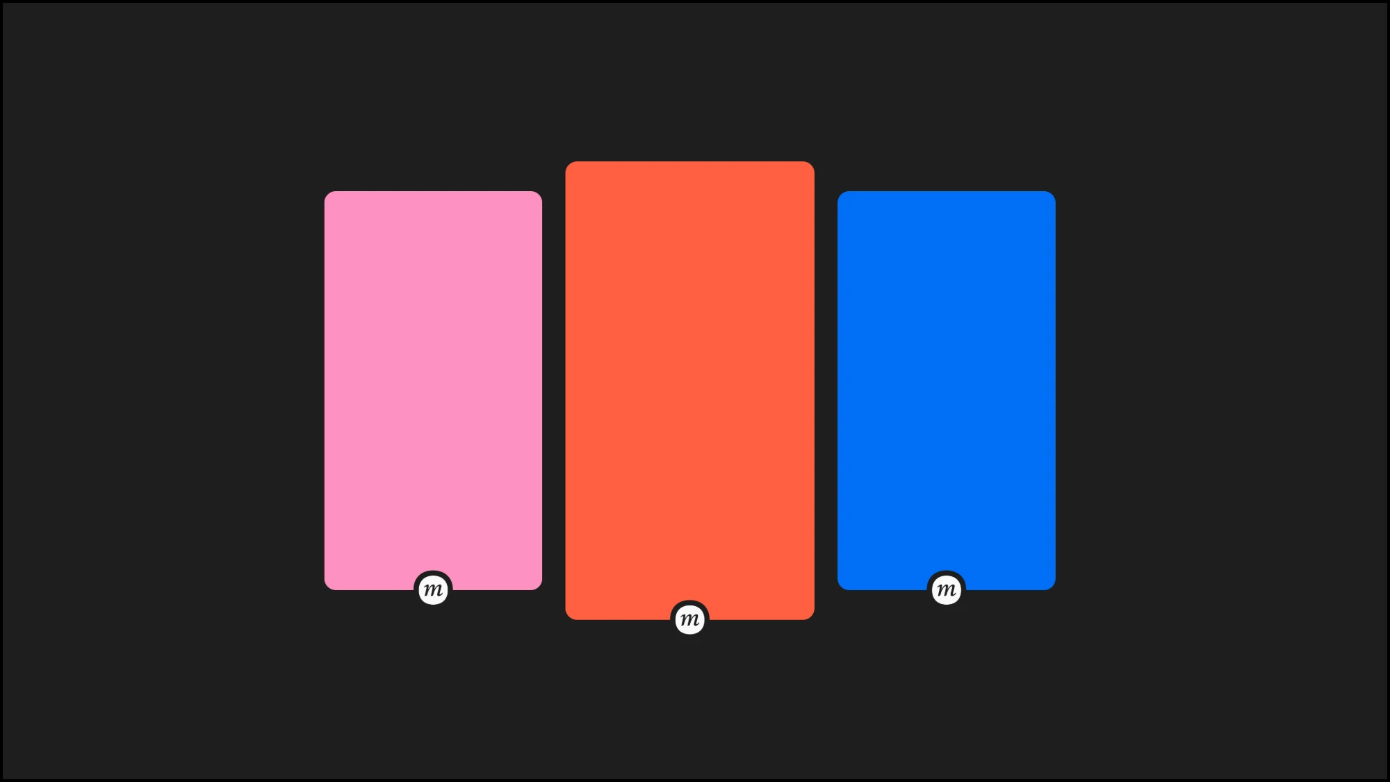 The black-and-white brand adapting to any color
The neutrals come from Tailwind’s Stone, a warm gray scale. I added one step, 150, between 100 and 200.
#fafaf9#f1f0ee#0c0a09Typography
Two typefaces share the work. Geist carries body text and headings: functional and direct, it speaks for the simple, practical side of the tool, the part that helps you find the right moment.
Libre Baskerville appears in specific interface elements. It is the human touch, a reminder that a moment is meant to be lived. The logotype uses a third italic, reserved for the mark.
Imagery
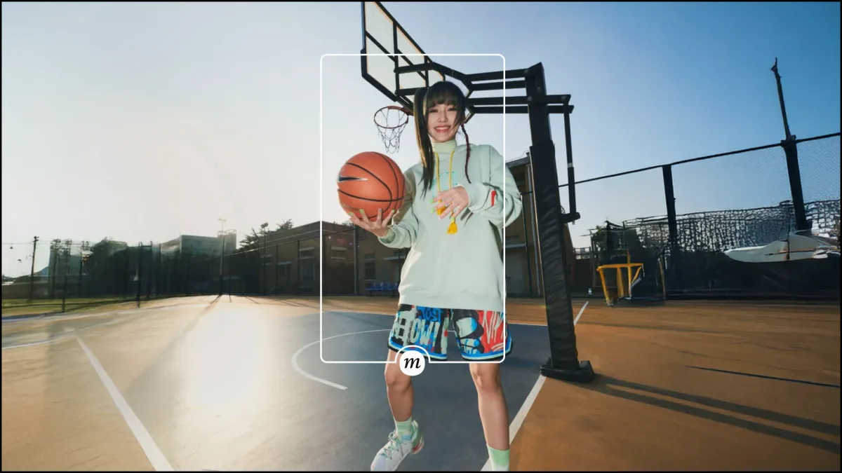
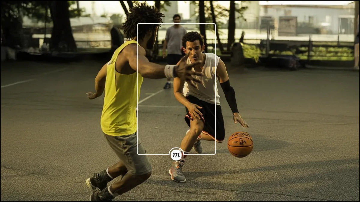
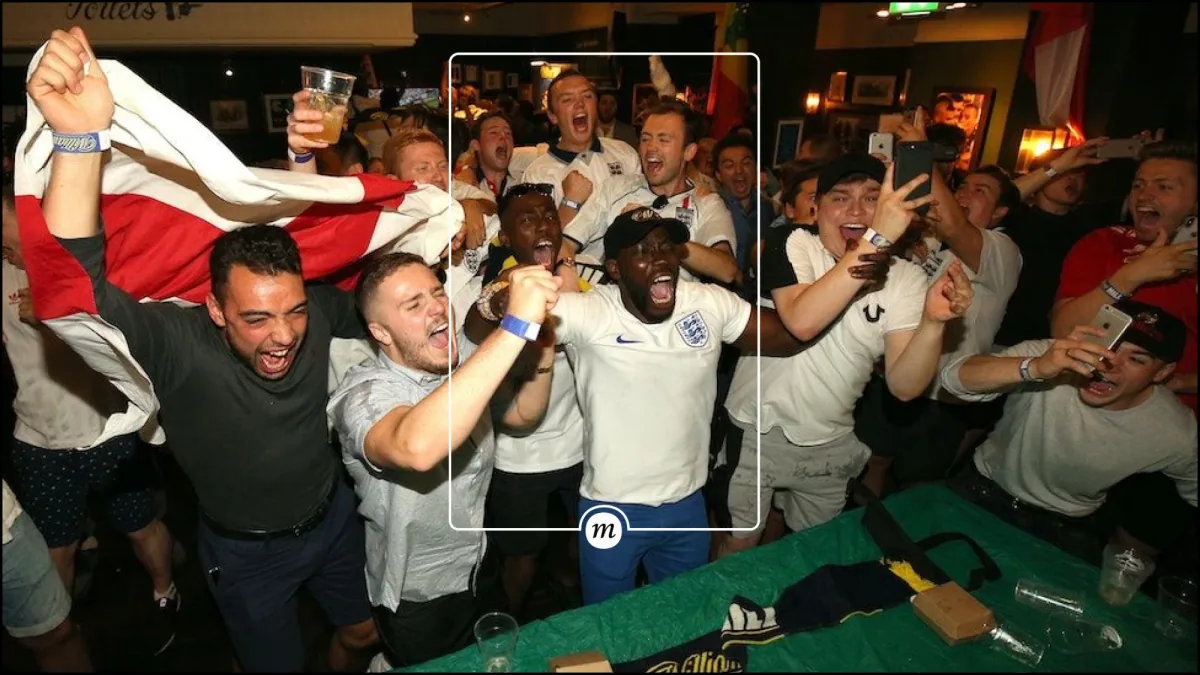
Before launch, with no clients yet, Moment had no photography of its own. I chose fully AI-generated images, made in Midjourney and Weavy and finished in Photoshop, with a conceptual rule.
When we remember the most striking moments of our lives, we keep the main thing. Everything around it gets a little blurry; we don’t remember exactly how it was. So every image keeps its subject sharp and surrounds it with motion blur.





The Frame
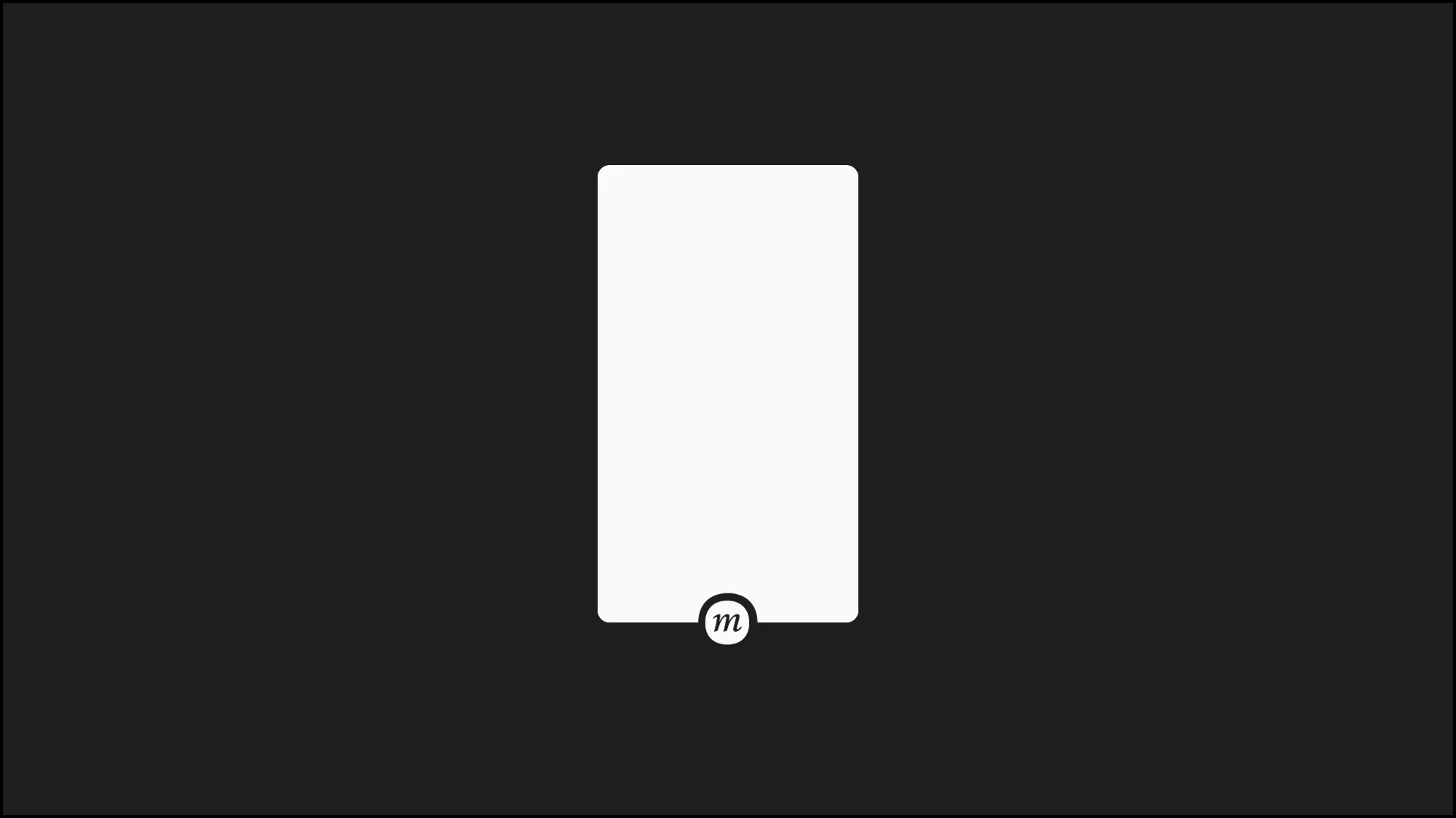
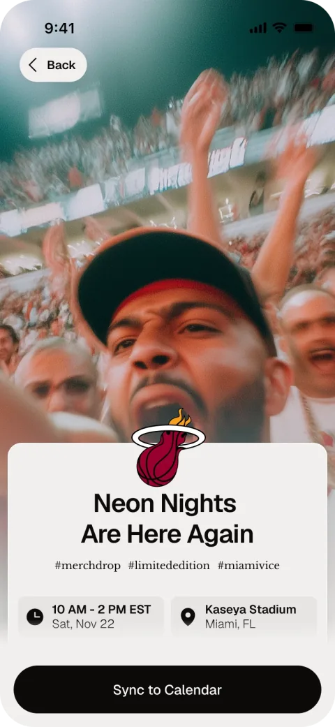
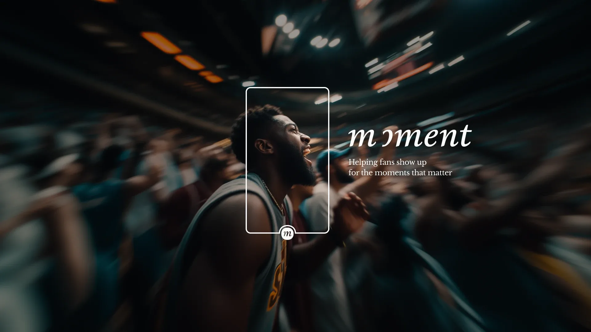
From the symbol came the frame: a rectangle with the logo at the bottom. The idea is simple. Anything that fits inside the frame can be a moment.
The Interface
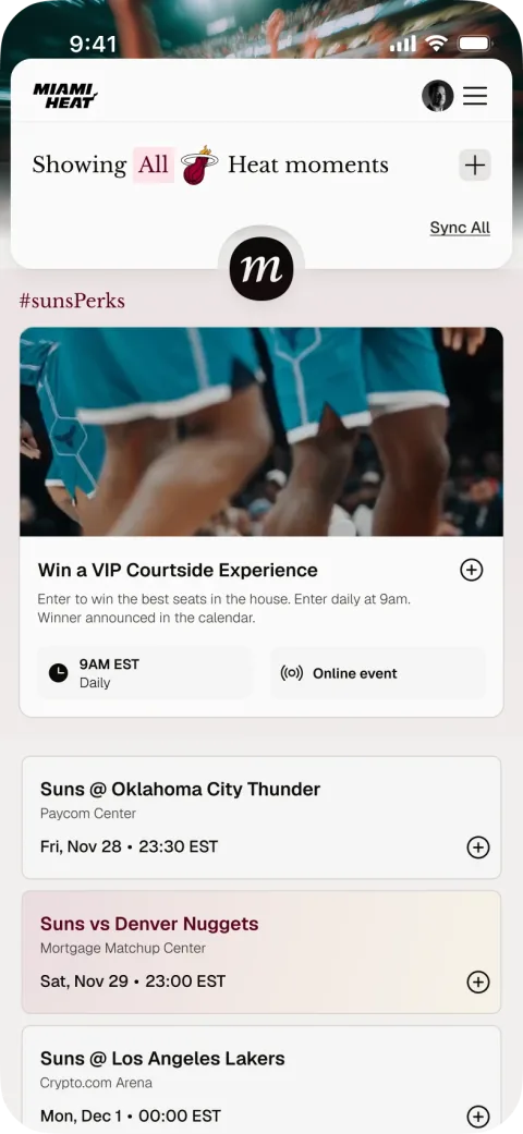
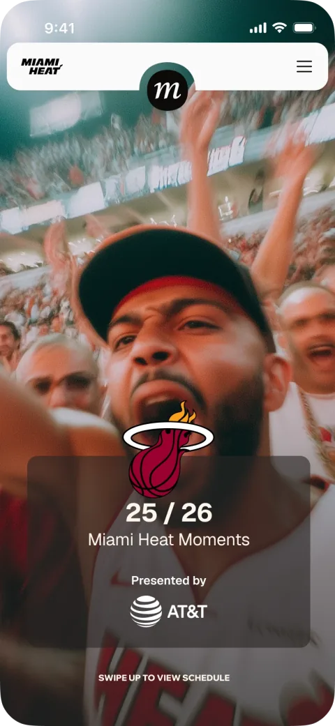
The frame became the visual and conceptual link in the first versions of Moment Live, which I designed with two temporary designers. It is the header card with the symbol at its bottom, and it is how people filter and interact with all of a brand’s moments.
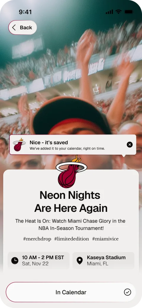
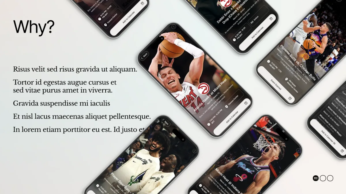
The moments themselves live in cards. Each card leads to one action: adding the moment to the calendar.
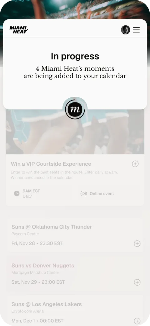
The same care goes into the smallest interactions. Adding a moment to the calendar, the product’s main action, answers with its own feedback, and the three-dot loading shows up wherever there is a wait. Labels and colors are parameters, not baked into the animation.

Social
I created all of Moment’s social communication, including a series of reels, one per feature. Each follows the same structure: a problem, “Meet” the feature, the feature working in the calendar, and a call to action.
The system carries over intact: black and white, the symbol, Geist for the facts and Libre Baskerville for the human line.
The Deck
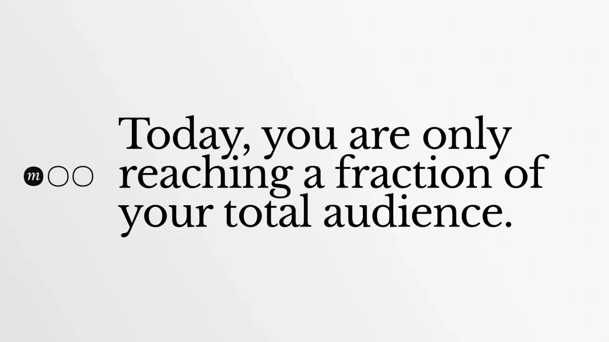
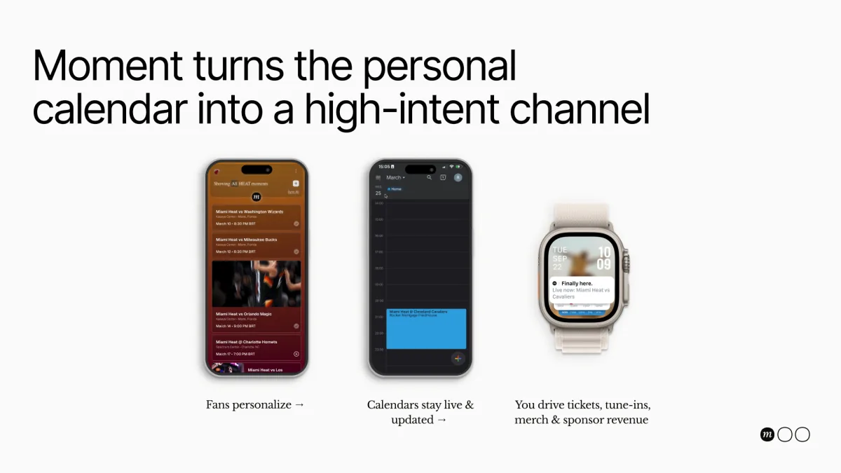
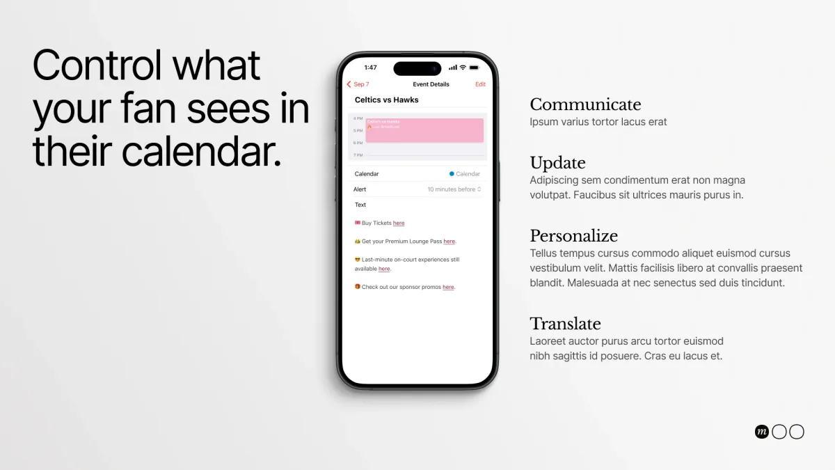
The decks and presentations were mine too, written for the teams and venues Moment sells to. The whole system shows up in the pitch: the frame on the cover, the ellipsis marking every slide, Geist for the claims and Libre Baskerville for the human lines.
The Launch
While I was at Moment, the product went live, and we won four major clients: the Miami Heat, Kaseya Center, the Atlanta Hawks and State Farm Arena.
These reels show it in the hands of fans: from the team’s Instagram to Moment Live, and from there straight into their calendar.
One imperfect dot ended up carrying everything: the symbol, the logotype, the loading, the frame, the interface, the reels and the pitch. That is what I look for in a brand: one idea strong enough to go everywhere, and quiet enough to let someone else’s moment be the star.