Interface Health Challenge
From redesigning the logo and visual identity to creating a crowdfunding page.
Concept · Design · Branding
- Role
- Brand Designer (freelance)
- Team
- Solo, working directly with the founder
- Company
- Interface Health Challenge / Mynd
- Year
- 2022 (identity) · 2024 (crowdfunding site)
- Outcome
- New logo, expanded palette, flyers and event posters — plus the website for the 2024 crowdfunding campaign
The Interface Health Challenge is a competition that rewards entrepreneurs developing solutions for health-related problems, with a strong focus on technology — especially AR/VR. They were looking for a refreshed visual identity.
 Previous Logo
The Challenge
I aimed to make the logo more symbolic without losing its impact. I also wanted to expand the color palette while staying true to the existing one.
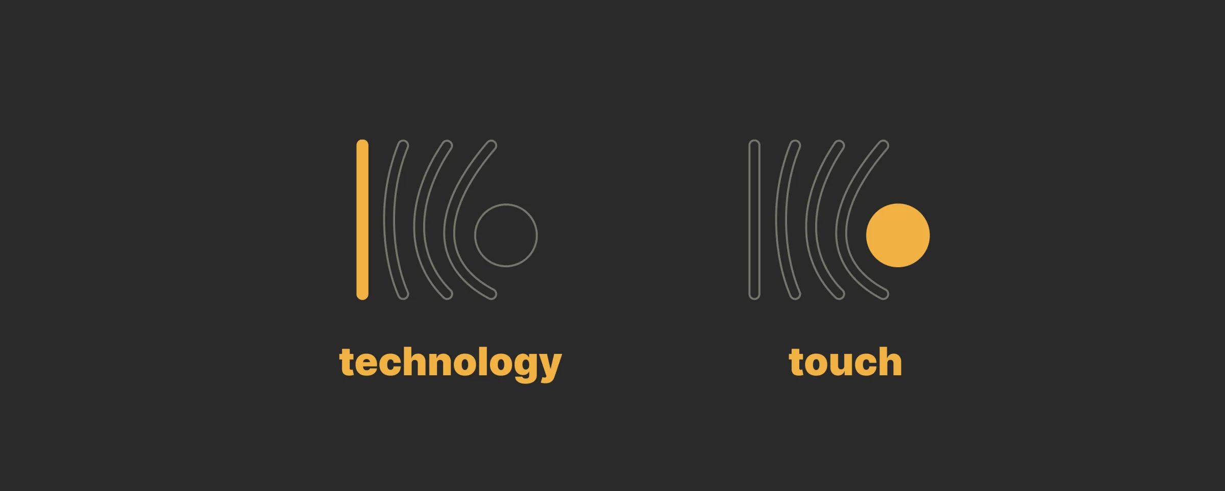 Technology / Touch
The Concept
The previous identity leaned heavily on the technological side, emphasizing connections and information networks. I didn’t want a clean break, but rather an evolution — making everything a bit more subtle and symbolic, since the brand was already established and no longer needed to be so literal.
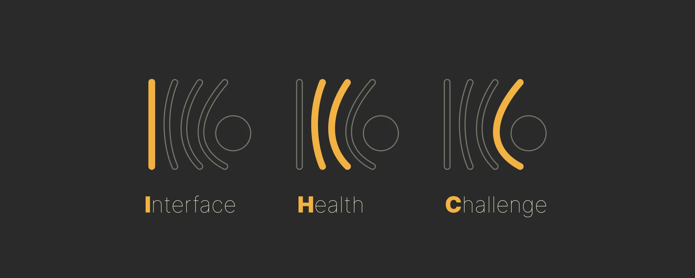 Interface / Health / Challenge
The Solution
On one side: technology, augmented reality, virtual reality, and the entire healthcare industry. On the other: people.
The solution was to focus on the interaction between these two worlds — so different, yet deeply interconnected — one influencing the other.
Healthcare technology is designed to be straight, precise; human interaction is unpredictable, provoking change and evolution.
Interface Health Challenge lives between these two worlds.
The straight line on the left represents technology, software, and the healthcare industry.
The middle lines represent the interface between the system and human interaction — symbolized by the circle: the human touch that changes and evolves everything.
The design also subtly recalls the straight lines in “IHC.”
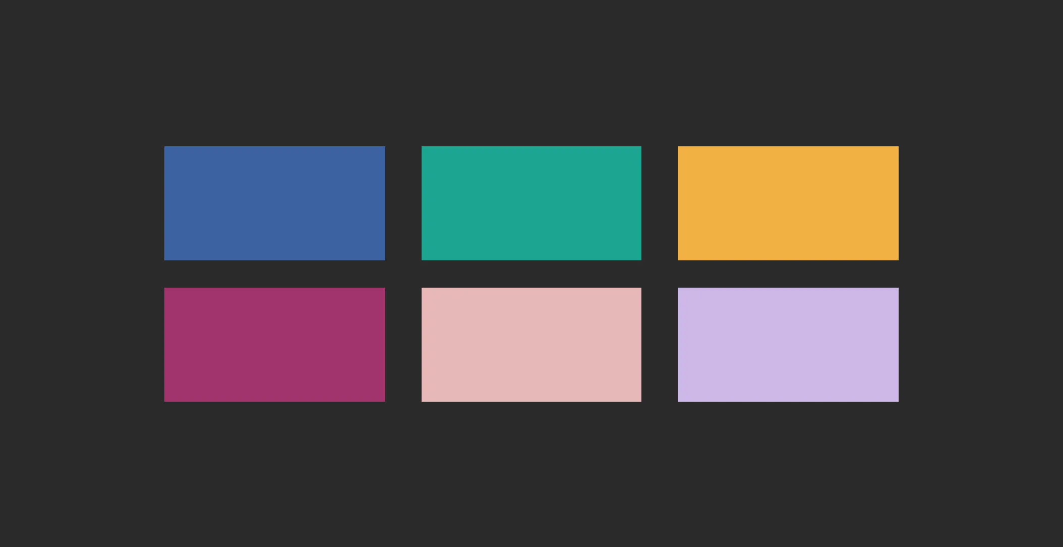 Color Palette
The Execution
To complete the new visual identity, I also created flyers, communication materials, and posters to be used before and during the event.
The expansion of the palette — previously limited to primary colors — into warmer tones brought out the brand’s more human side, while also adding dynamism.
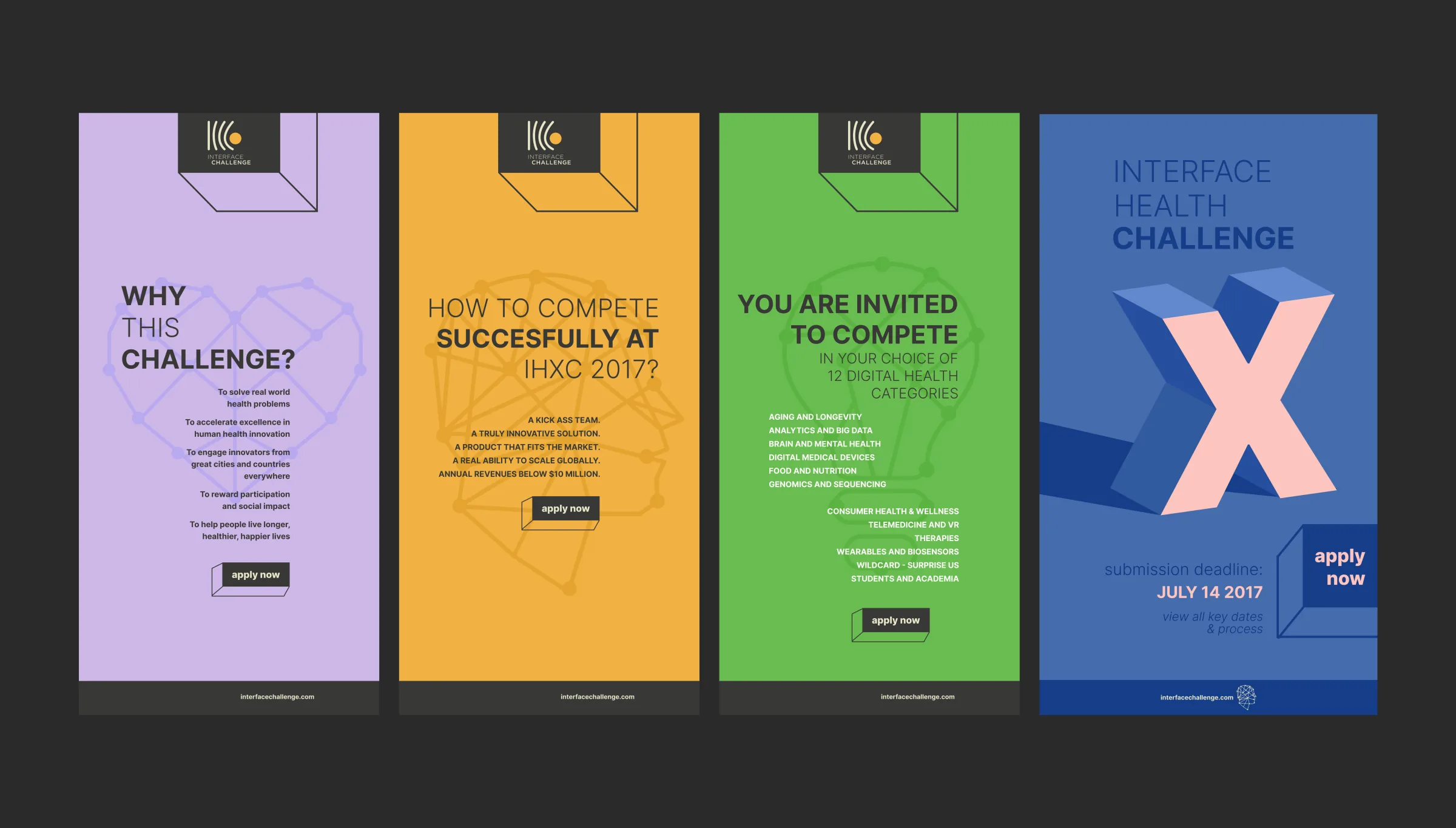 Flyers / Poster
The Website
Later, Mynd — Interface Health’s parent brand — ran a crowdfunding campaign for one of its apps. To support it, I designed a website that explained the product in a simpler, less technical way.
Since it was highly technical medical VR software, backed by studies and validations, it was crucial that it could be understood by a broader audience without losing its seriousness.
The solution was to focus on one key feature and explain the technical aspects through that lens.
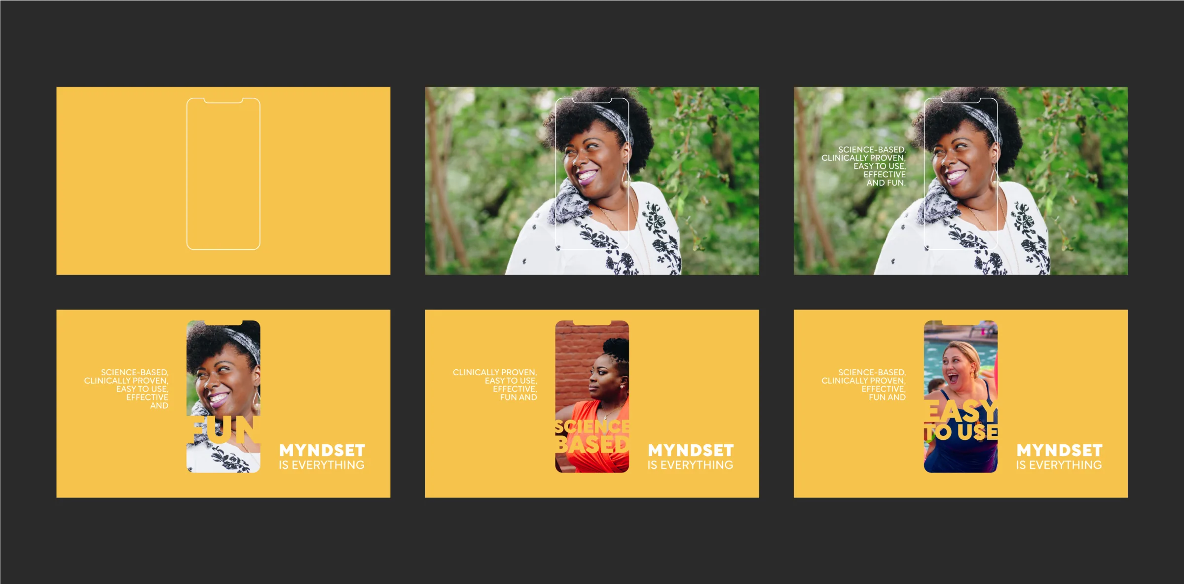 Crowdfunding website for Mynd’s app — key screens
The Impact
Although the award ceremony did not take place due to the pandemic, the redesign was well-received by founders and investors, and it helped guide the crowdfunding campaign launched in 2024.