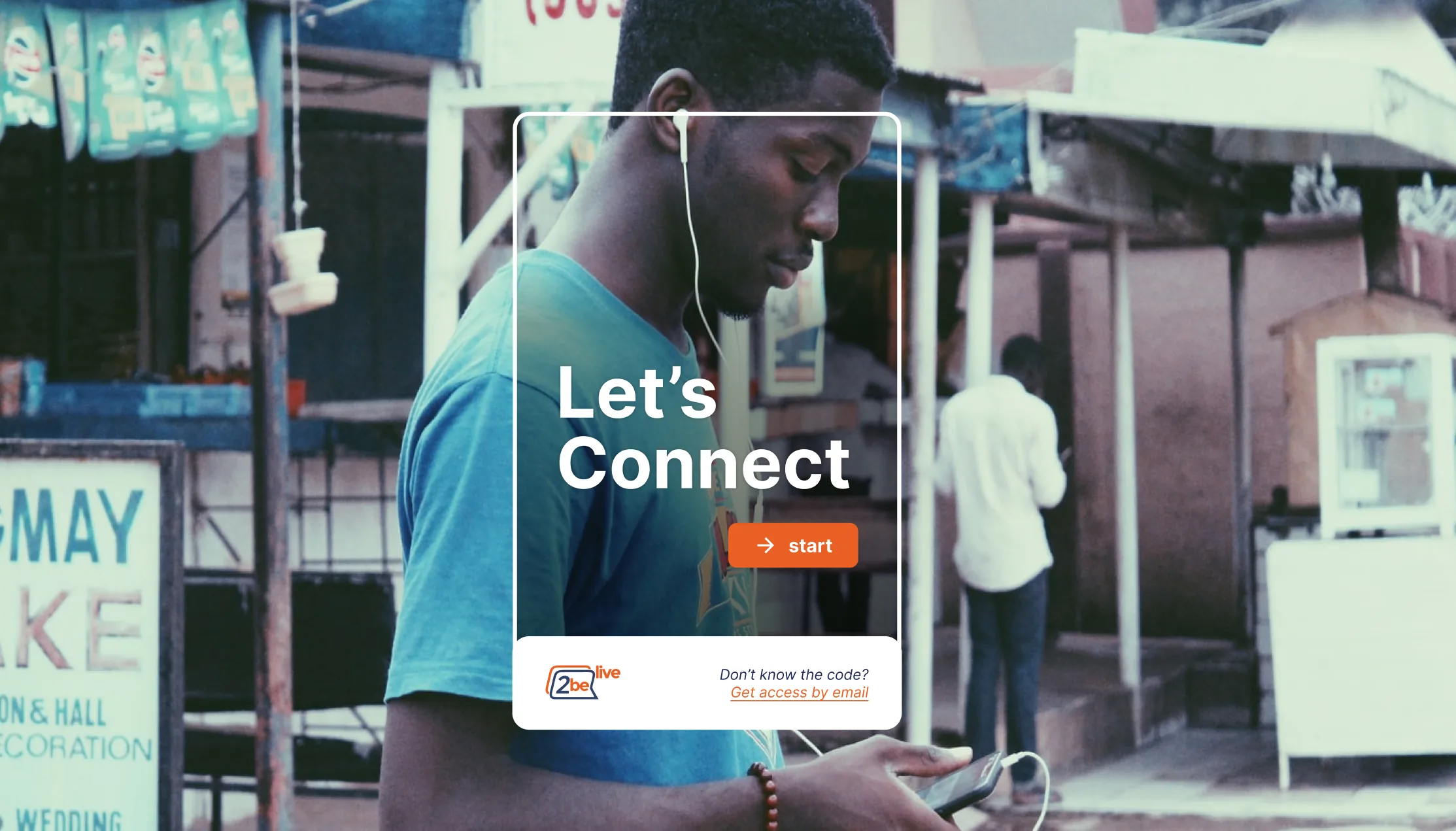
2BeLive
An innovative platform, in the right place at the right time — but with the wrong interface.
UX/UI · Product Design · Design System · Prototyping
- Role
- Product Designer, design lead
- Team
- 2 designers (me as lead + 1), a Product Owner, the founders/CEO, and stakeholders
- Company
- 2BeLive — EdTech startup, pre-launch
- Year
- 2020–2022
- Tools
- Figma, atomic design
- Outcome
- Pilot schools that had complained most about onboarding stopped raising the issue; a scalable Design System for the whole platform
2BeLive started as a visionary project: a fully online education platform designed to modernize distance learning. But with the sudden arrival of the pandemic, what was meant to be a long-term rollout suddenly had to move fast.
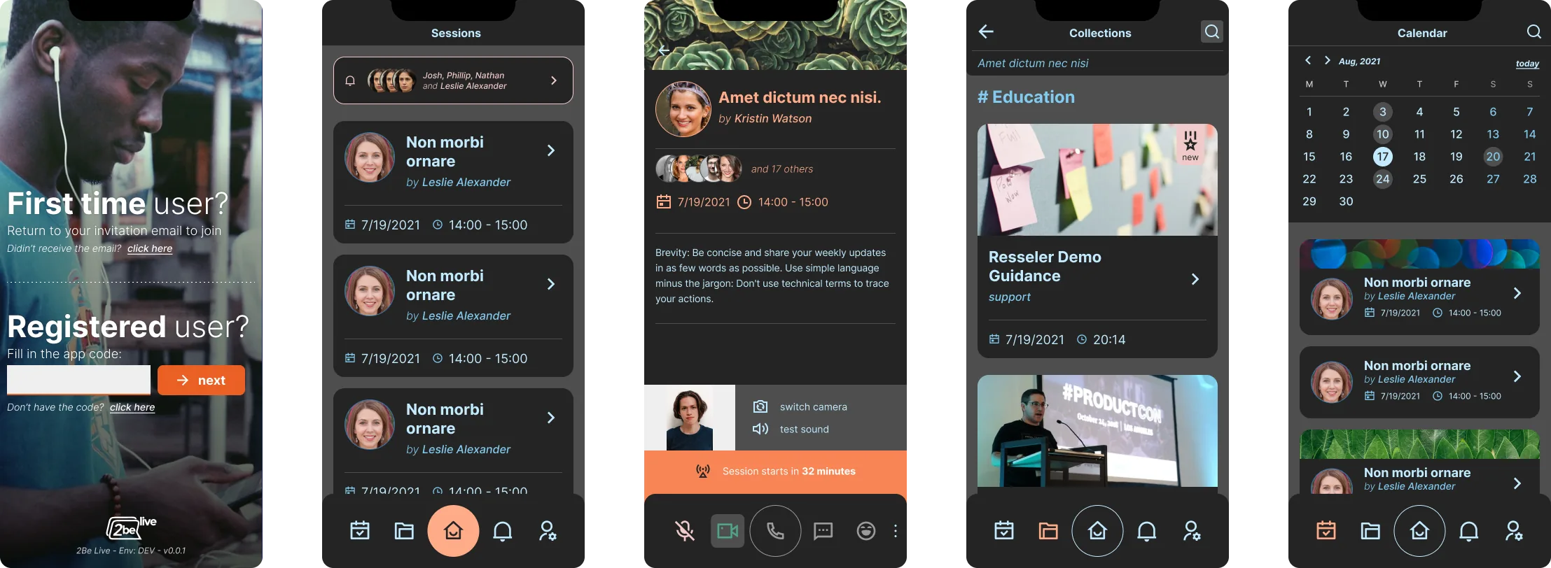 Mobile Interface
The Challenge
While the platform was already functional, the user experience was underdeveloped, with unclear flows and no consistent visual identity. The biggest challenge was to propose real improvements without adding pressure to the already small and overworked engineering team, racing against pandemic-driven deadlines.
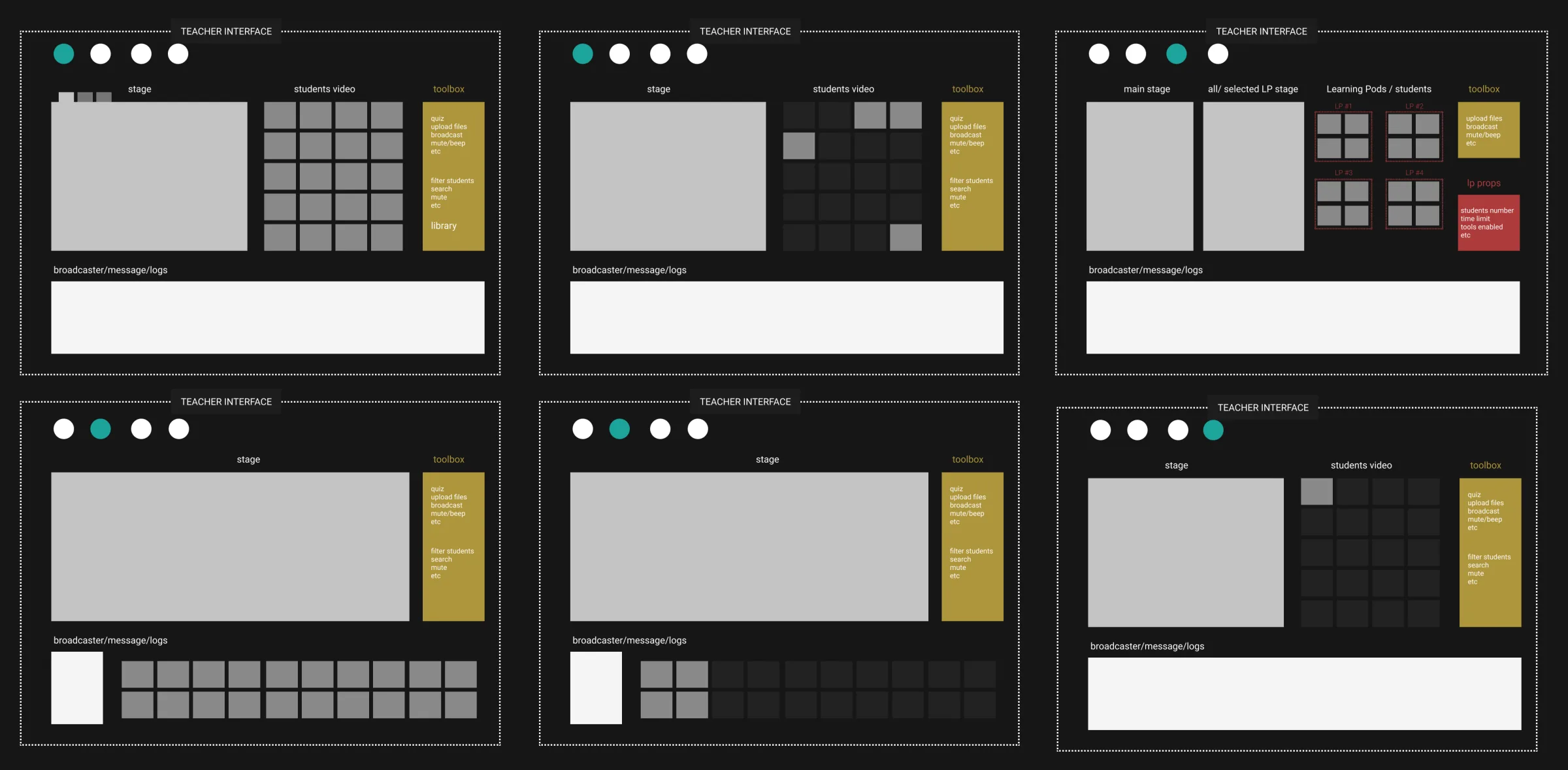 Learning Pods Wireframe
The Concept
The product was right for the moment; the interface wasn’t. When everything feels urgent, the smartest response is to simplify: fix the moments where students and teachers struggled most, and give the small team a system to build every new screen consistently.
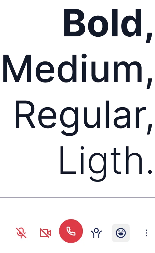 Typography / Iconography
The Solution
I began by redesigning the onboarding experience, especially for students with slow internet, old phones, or low digital literacy.
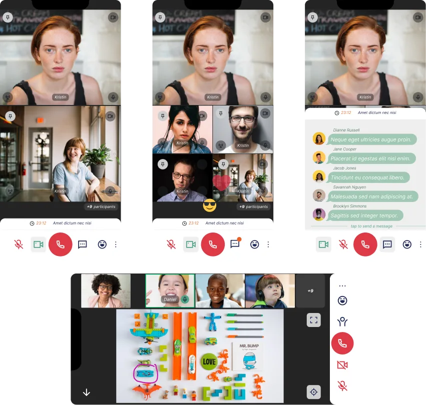 Live Session
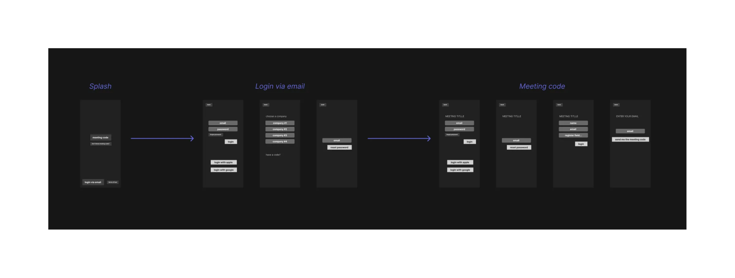 Onboarding flow
My key change was reversing the onboarding flow: instead of requiring users to register before joining a class, we let them enter and start watching — and only asked for their details later. In the pilot, schools that had complained most about onboarding stopped raising the issue altogether.
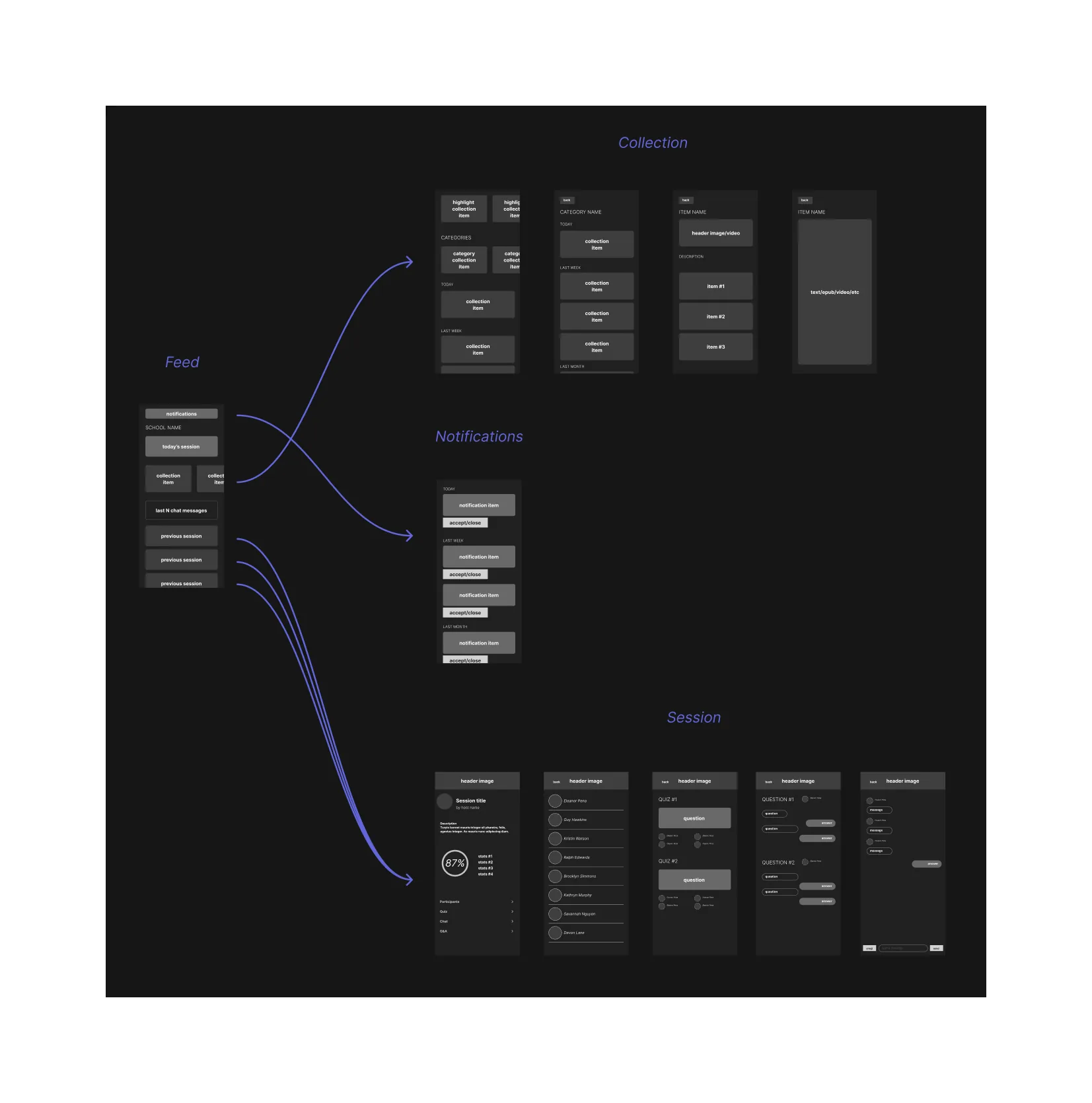 Feed flow
Once students were inside, we focused on giving teachers better control over the online classroom — ensuring they could manage their lessons with the same attention and confidence they’d have in person.
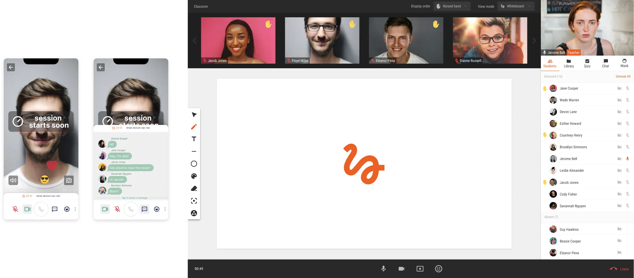 Classroom on different devices
The Execution
The interface needed to be invisible when necessary, but delightful when noticed. It had to support learning, not distract from it — while still sparking curiosity, engagement, and playfulness, especially for younger learners.
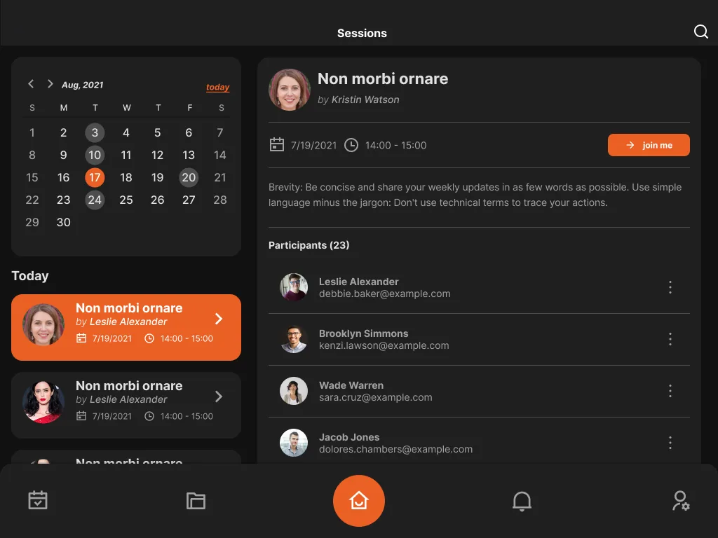 Calendar interface
I designed with neutral colors, highly legible fonts, and straightforward iconography — not just for aesthetics, but to ensure maximum accessibility. Visual contrast, font sizing, and responsiveness were treated as critical features.
All of it lived in a Design System I built in Figma using atomic design — from tokens and basic elements to full components — so the small team could keep shipping consistent screens fast.
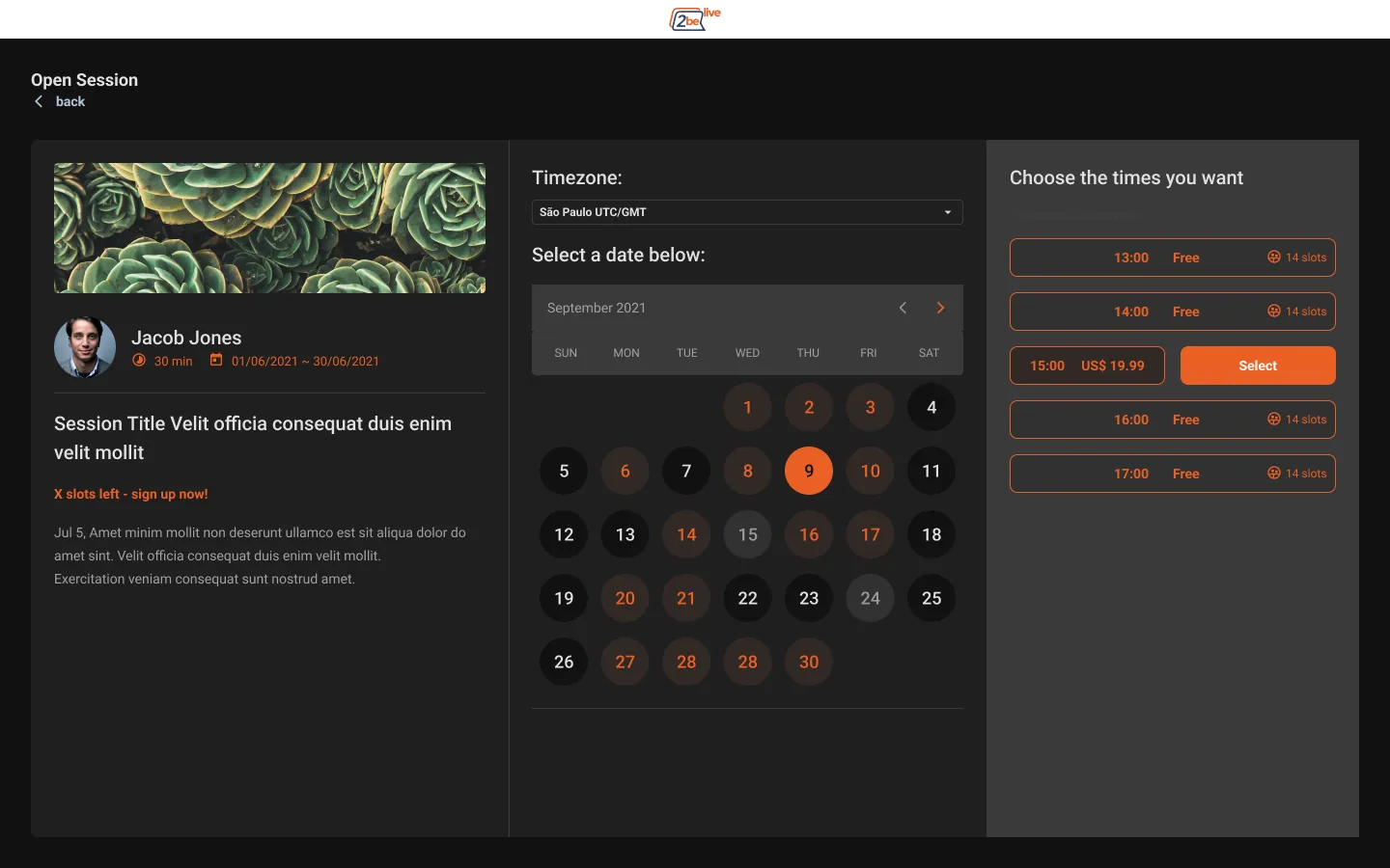 Open Session interface
I also made sure the platform was fully functional across all devices, including older smartphones — because education should never be limited by hardware.
The Impact
Despite technical and logistical challenges, during the startup’s pre-launch phase we delivered a simpler, more accessible platform and a cohesive, scalable Design System — built so students could stay connected to their learning, no matter where they were or what devices they had access to.
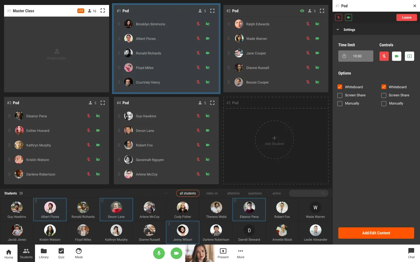 Learning Pod interface